SORA Spa & Sauna
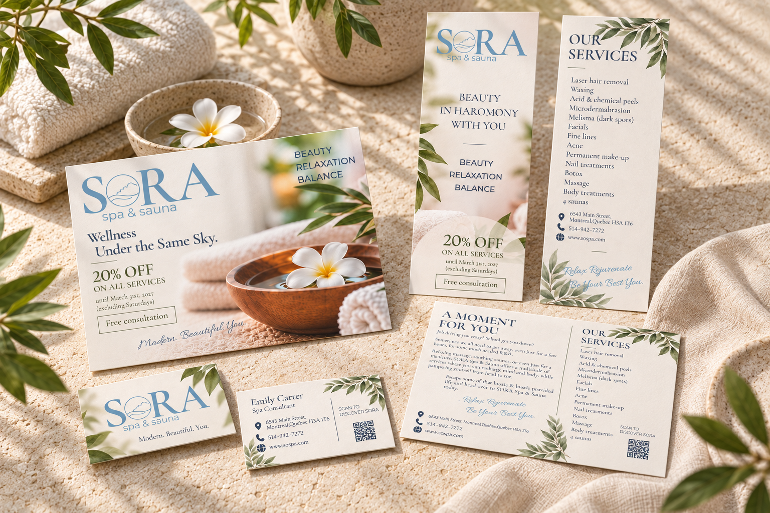
Overview
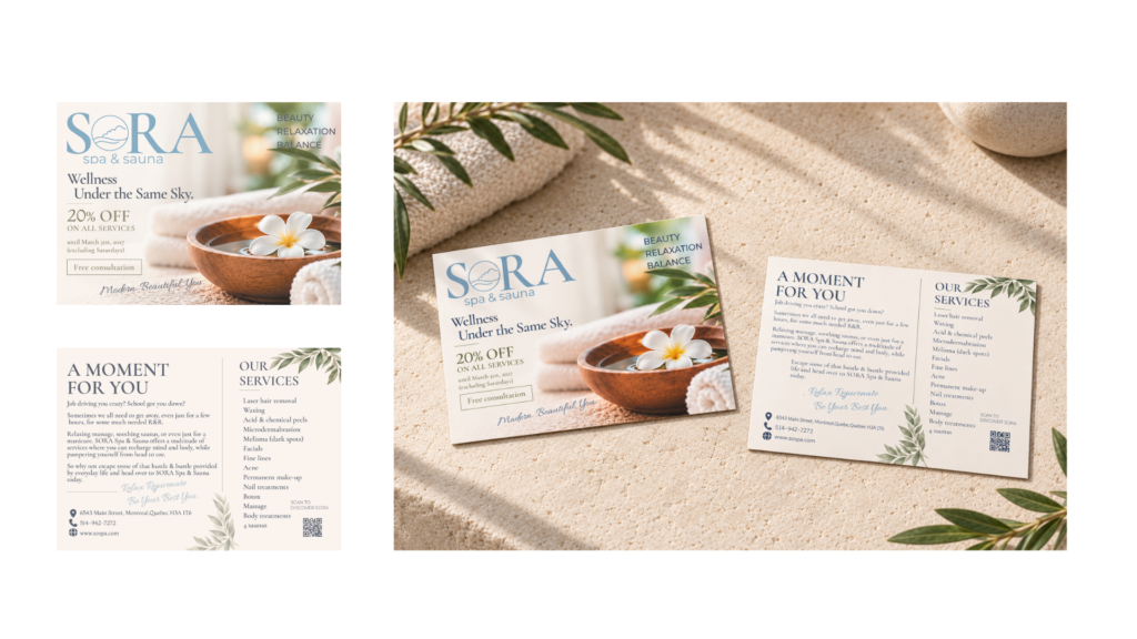
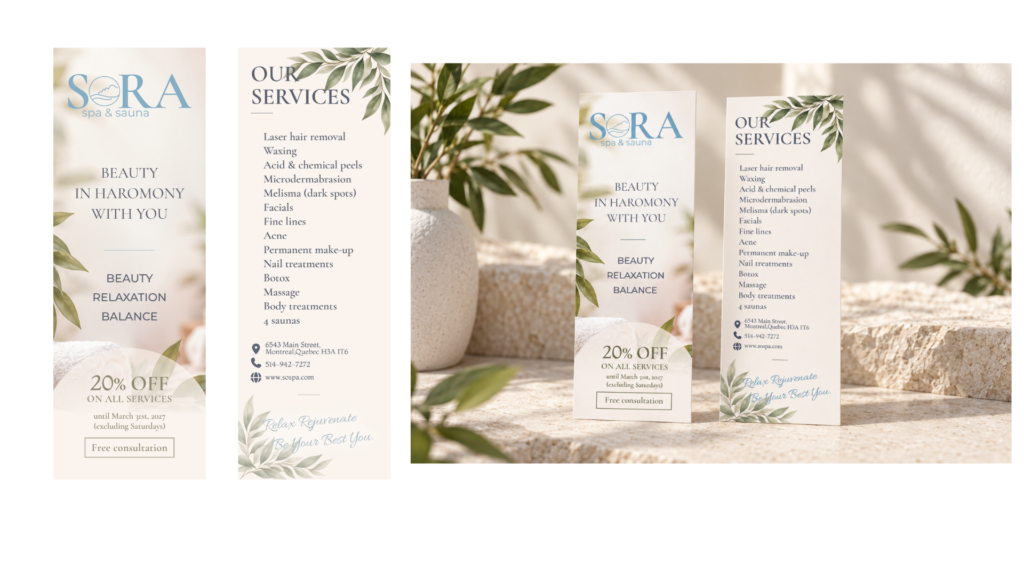
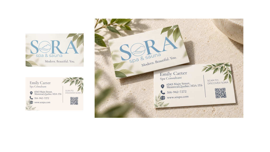
A student concept project featuring a coordinated set of promotional materials for a fictional spa and sauna brand. The project includes a postcard, promotional insert, and business card, designed with a calm and consistent visual identity.
架空のスパ&サウナブランドのために制作した、学生コンセプトプロジェクトです。ポストカード、プロモーション用インサート、ビジネスカードを、穏やかで統一感のあるビジュアルに仕上げました。
Role
Visual Identity
Print Design
Year 2026
Tools
Adobe Illustrator
Adobe InDesign
Adobe Photoshop
Concept
A peaceful retreat inspired by the openness and calm of the sky.
空の広がりと穏やかさを感じられる、心と身体を整えるための静かな場所。
Process
Challenge
Create a unified set of print materials that communicates the spa’s relaxing atmosphere while presenting its services, promotional offer, and contact information clearly across three different formats.
スパの穏やかな雰囲気を表現しながら、サービス内容、特典、連絡先情報を、サイズや目的の異なる3種類の印刷物で分かりやすく伝えることが課題でした。
Solution
I developed a cohesive visual direction using soft blue-gray tones, warm neutrals, botanical imagery, and generous white space. Consistent typography and image treatments connect the postcard, insert, and business card as one promotional system.
柔らかなブルーグレー、温かみのあるニュートラルカラー、植物の写真、ゆとりのある余白を用いて、統一されたビジュアルを設計しました。共通の書体と写真表現によって、ポストカード、インサート、ビジネスカードを一つのプロモーションツールとしてまとめています。
Design System
Colour Palette
Mist Blue Gray
#A7BAC7
Soft Olive Taupe
#8E8A73
Deep Gray Blue
#5B6270
Soft Sage
#A0B39B
Warm Ivory
#FAF3ED
Aa Bb Cc
Cormorant Garamond
Display / Headings
Aa Bb Cc
Montserrat
Body Text
Aa Bb Cc
Allura
Accent
Gallery