Bakery
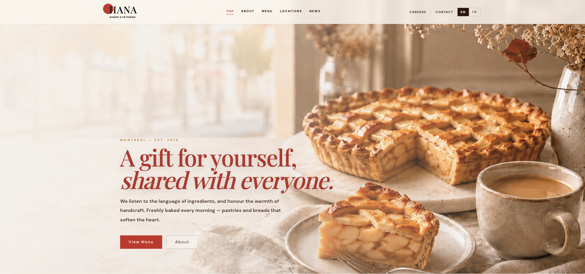
Overview
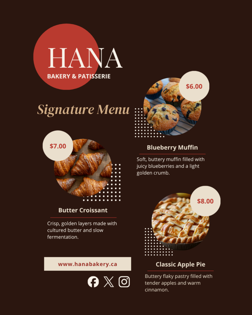
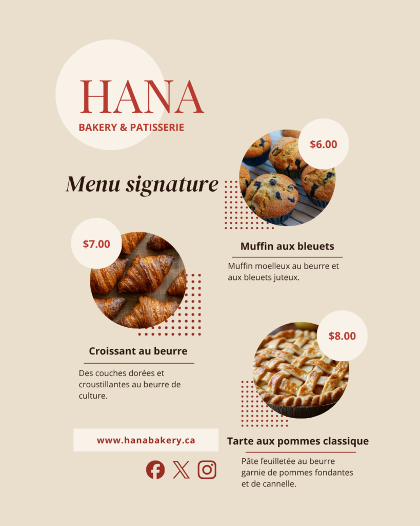
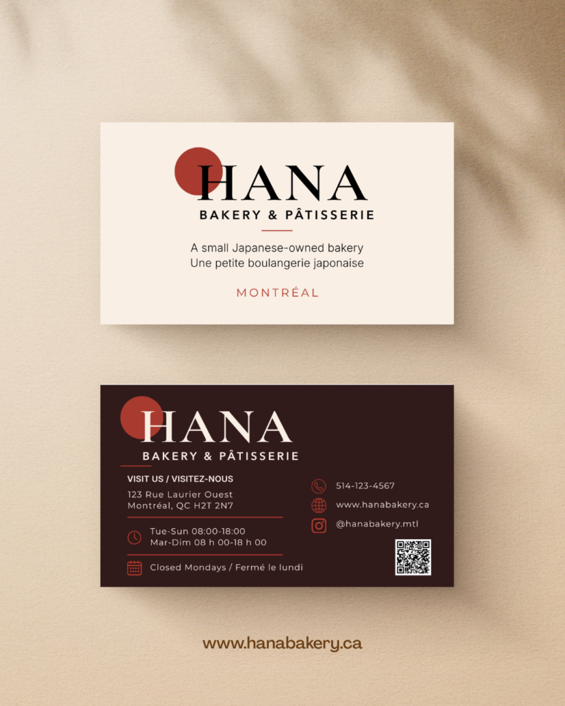
A branding and website project for a small Japanese-owned bakery in Montréal. The project combines web design, front-end development, and visual communication across digital and printed materials.
モントリオールで日本人が営む小さなベーカリーを想定した、ブランディングとウェブサイト制作のプロジェクトです。Webデザインとフロントエンド実装に加え、ショップカード、フライヤー、Instagram投稿まで一貫したビジュアルで展開しました。
Role
Web Design
Front-end Development
Visual Design
Year 2026
Tools
Figma
Canva
HTML / CSS
JavaScript
Concept
The name ‘Hana’ (花 ) means flower in Japanese. It reflects the bakery’s warm, gentle character and its aim to become a familiar presence in the local community.
「HANA」は、日本語で「花」を意味します。その名前に、温かくやさしい店の雰囲気と、地域の日常に自然に根づく存在でありたいという思いを込めました。
Process
Challenge
Convey warmth and craft without leaning on typical Japanese visual clichés. The brand needed to feel rooted in Montréal’s food culture.
日本的なビジュアルの定番表現に頼らず、温もりと職人的な質感を表現すること。モントリオールの食文化に根ざしたブランドに仕上げることが課題でした。
Solution
A warm visual system built around cream, deep brown, and muted red. Editorial typography, generous photography, clear content sections, and consistent printed materials create a cohesive and recognizable brand experience.
クリーム、ディープブラウン、落ち着いた赤を中心に、温かみのあるビジュアルシステムを設計しました。エディトリアルな書体、大きな写真、明確な情報構成、印刷物との統一感によって、認識しやすいブランド体験に仕上げています。
Design System
Colour Palette
Deep Brown
#2B160F
Bakery Red
#B93A2F
Dark Red
#982D24
Warm Cream
#F8F2E9
Soft Beige
#E8D8C8
White
#FFFDF9
Aa Bb Cc
Playfair Display
Display / Headings
Aa Bb Cc
DM Sans
Body / Interface
Gallery